Editing Style
It’s been two years since I decided to pursue photography full-time, and in that time, learning how to edit photos has been the hardest, yet still enjoyable, part. I have learned much, and my recent photo edits have been cleaner and more deliberate. I’ve learned not to rely on presets, that every adjustment slider doesn’t need to slide, and generally, less is more. I am currently debating whether I should go back and re-edit some of my older photos, some are embarrassingly cringe worthy – how did I ever think this looked good?
Over-sharpened and over-saturated would be the main critique of my earlier work.
Many photographers (and artists in general) talk about developing their style, something I have put very little thought into. It sounds restrictive and limiting, but I like to explore and experiment. So, I just carried on, sliding the adjustment sliders around until something looked good, or I got bored and moved on without a care in the world about developing any consistency in my edits.
Then, recently, during a late-night photo editing session, halfway through a bottle of red, I thought: What if I treated these adjustment sliders as if they were personality traits? What would that look like?
I randomly selected a photo I took last year and began editing it from scratch, treating each slider as if it were, well, me.
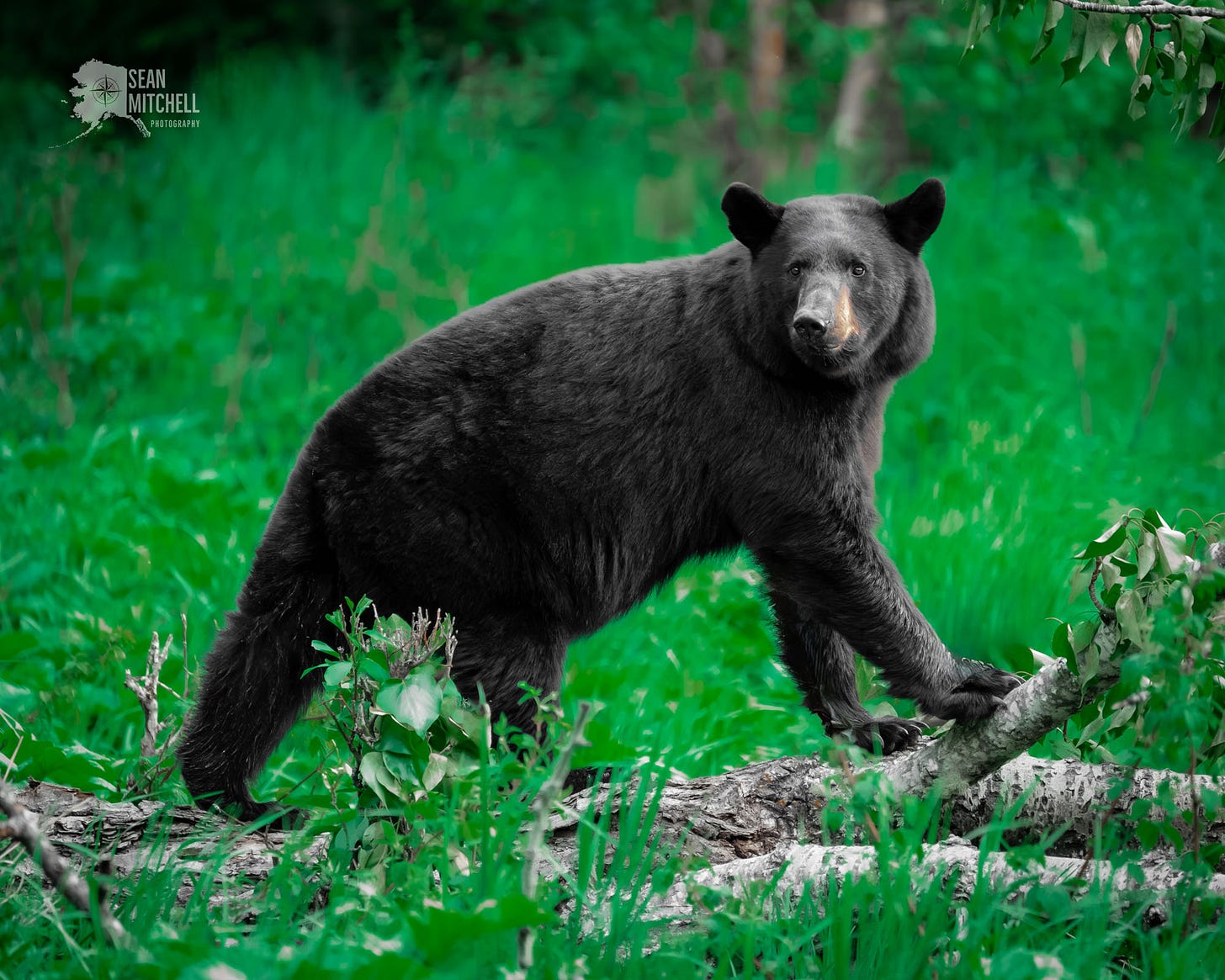
Spot removal tool. I'm not too fond of distractions. Distractions are useless and should be eliminated in all aspects of life. So, I went around the photo and removed distractions. Flies and mosquitos often surround these bears, and I removed a dozen or more. Bits of leaves and twigs were in the bear’s hair, which I also removed. Clutter be gone!
Exposure. I do not like bright lights, sunny days, screens, or anything that makes me squint. I want to see clearly and evenly, so I brought the exposure down a notch.
Highlights. I’m not a fan of shiny, flashy things, especially when they distract and blur out details. Highlights down a notch.
Blacks and shadows. I don’t like mystery, so no solid blacks. I want to see some detail everywhere I look—shadows and blacks up a notch.
White balance. Keyword - balance. I like things in balance, with no drama, so I slid the temperature to somewhere in the middle, not too cold or hot, nice and balanced.
Clarity. I love clarity in all things. Clarity on issues, problems, everything. So, I bumped that up a bit.
Texture. While I love clarity, I don’t need to know every little detail about everything. I dropped the texture down some. For most things, the big picture is good enough for me. No need to be distracted by the tiny details.
Vignette. I like to focus on what I’m looking at, reading, fixing, doing, whatever. I added a bit of dark vignette around the edges to focus the eye more into the center of the photo, and on the subject.
Color Mixer. Color is essential, but not that important. I view color as a supporting actor, something that needs to be there, but not stealing the show. In other words, supporting points shouldn’t be allowed to distract from the main point. I didn’t touch the global vibrance or saturation sliders and chose to deal with each color separately. There was very little, if any, red, blue, aqua, magenta, or purple in this picture, and since I don’t like loose ends, I dropped those saturation levels to zero. Green is the most prevalent color, and it was a bit overwhelming, so I took most of the yellow out, which toned down the green, and then I dropped the green saturation, too. I also dropped the luminance value of the green. By doing this, I shifted interest from the surrounding green shrubbery and focused more on the bear, the important part. I also reduced the orange some, but left enough to keep the bear’s nose that golden brown. Some of my earlier edits were so color saturated that the colors became the main subject, which means the viewer is distracted, missing the point, and I don’t like to miss the point.
I thought about making this a black-and-white photo, but I’m not naive enough to think anything is truly black and white, no matter how much I wish it were.
And that’s where I left it. I did no color grading, sharpening, orton glow, or use any of the other magical editing tools because I do not like to overcomplicate things. I am a big fan of simplicity in all aspects of my life.
Here’s the result.
I think I like it, but I’m not sure. Perhaps I’ll finish the rest of that bottle and play with this on a few more photos.
What do you think?
Here’s the original edit I posted to Facebook a year and a half ago for reference - YUCK! Augh! My eyes, my eyes!
Trail Shot
The other day, I went hiking to a local waterfall and found the trail awash with overflow. Basically, the river dams itself up as it freezes, causing water to overflow the banks. And while getting your feet wet in winter is generally a bad idea, I was only five minutes from my car at this point.
Recent Edits
And that’s all for this week!
Thank you for being here,
Sean Mitchell
From the Chugach


I really like how you framed editing like personality traits. Very intriguing and insightful. I agree that the original bear photo is overly saturated and bright... but the redone one seems a little too much the other way, at least for my tastes. That said I'm no pro and am still figuring out all the editing stuff myself, just fiddling with settings, as you mention, until I'm happy enough. So much to learn!
Wow I LOVE that idea actually. I've been struggling with the same thing - what is my ~style~, but now i'll have to keep that in mind when moving my sliders around haha